


Custom Power BI dashboards on top of your existing data sources, connected to your live systems, designed around your business logic, and built so you can open them and trust what you see immediately.
Looker implementation from the ground up: LookML data model, custom dashboards, and access governance for businesses that need a governed analytics layer they can actually rely on.
Fully custom Looker Studio dashboards on top of your Google data sources: GA4, Google Ads, Search Console, BigQuery, so you gain a live, accurate view of performance.
As an official Klipfolio partner, we build custom dashboards for real-time KPI monitoring across any data source, deployed faster than heavier BI platforms and backed by certified partner expertise.
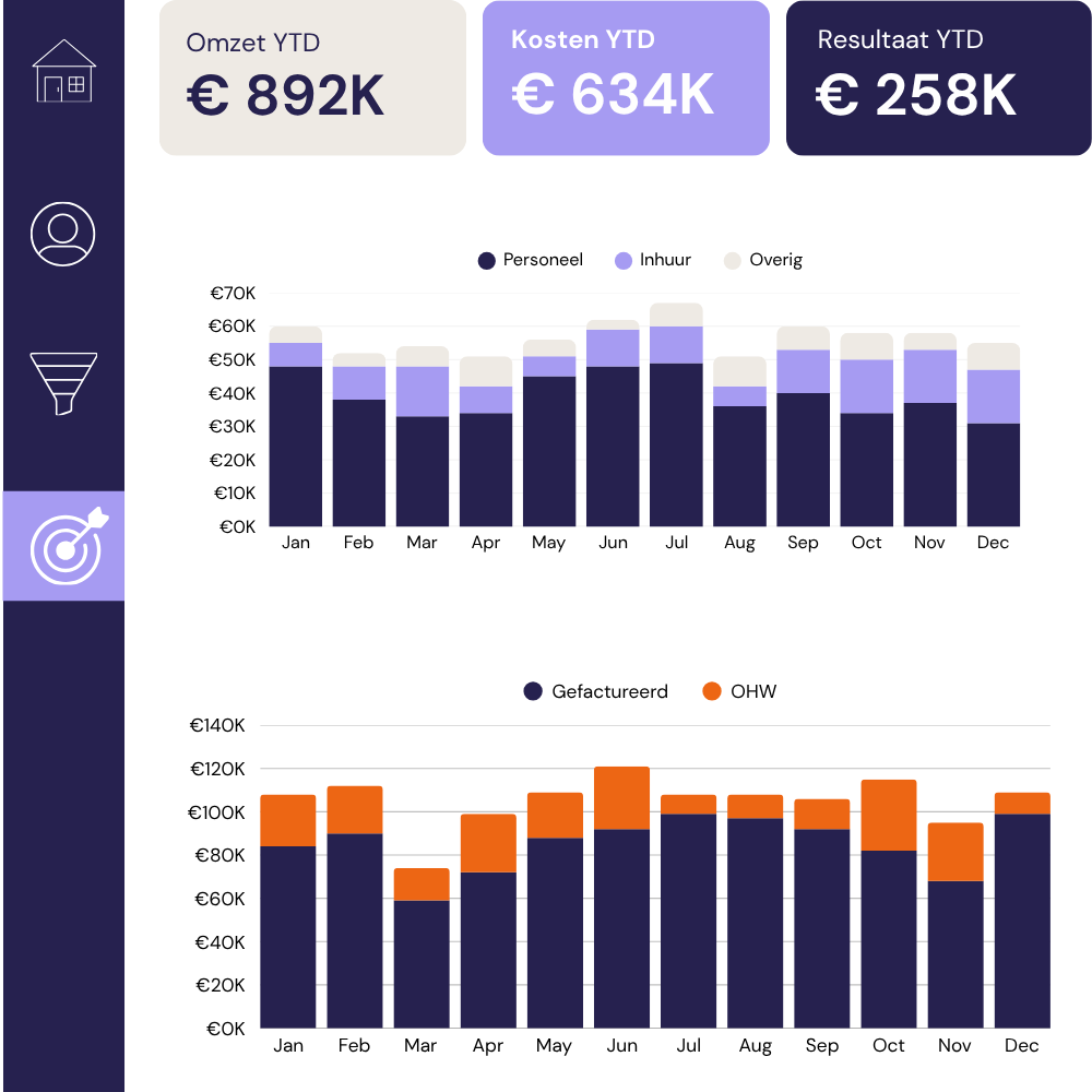
If your business runs on Simplicate, we connect directly to your environment and build a custom dashboard that gives you a live overview of hours, projects, pipeline, and margin.
Before you invest in data tooling, platforms, or hires, a data assessment gives you an honest picture of where your setup stands today: what is working, where the gaps are, and a plan for what to do next.

Connect Claude Code directly into your dbt and/or Power BI environment in 1 day, tested against your models and datasets; handed over with a walkthrough so you can use it immediately.
For B2B agencies and consultancies that need practical data insight, we build custom solutions covering live dashboards, structured data outputs, automated KPI alerts, and interactive reports.

Looking for something you don’t see in our modular product range? Our data and AI expertise goes well beyond what is listed here. Tell us what you need and we will build it.