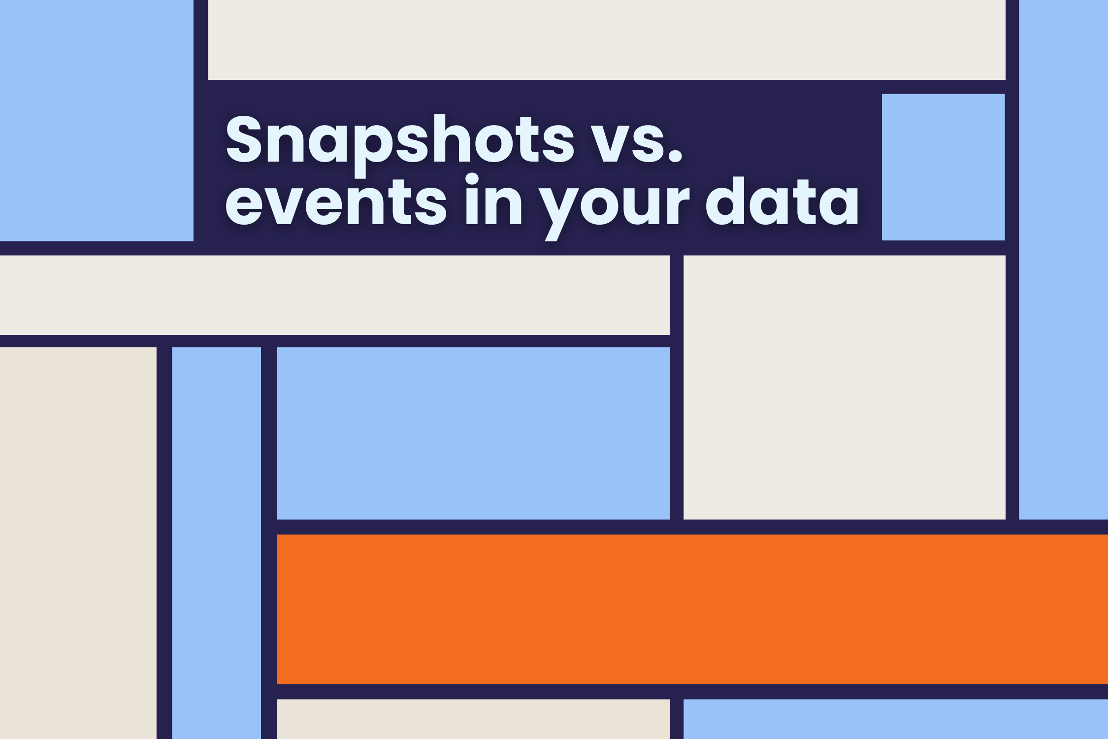
A simple concept that prevents misleading analyses
I’ve been involved in the data world for many years, and I see a fundamental concept that is consistently overlooked in education and training. It seems straightforward, yet eventually, everyone encounters a confusing or misleading analysis where the cause of the confusion, or even worse, error, can be traced back to precisely this concept.
The distinction between data snapshots and events.
As a part of the data world, you’ve undoubtedly worked with it before.
Have you, like most of your colleagues, fallen into the trap of not having a clear distinction?
Before we go any further, let’s look at what the distinction actually means in practice.
What distinguishes snapshots and events?
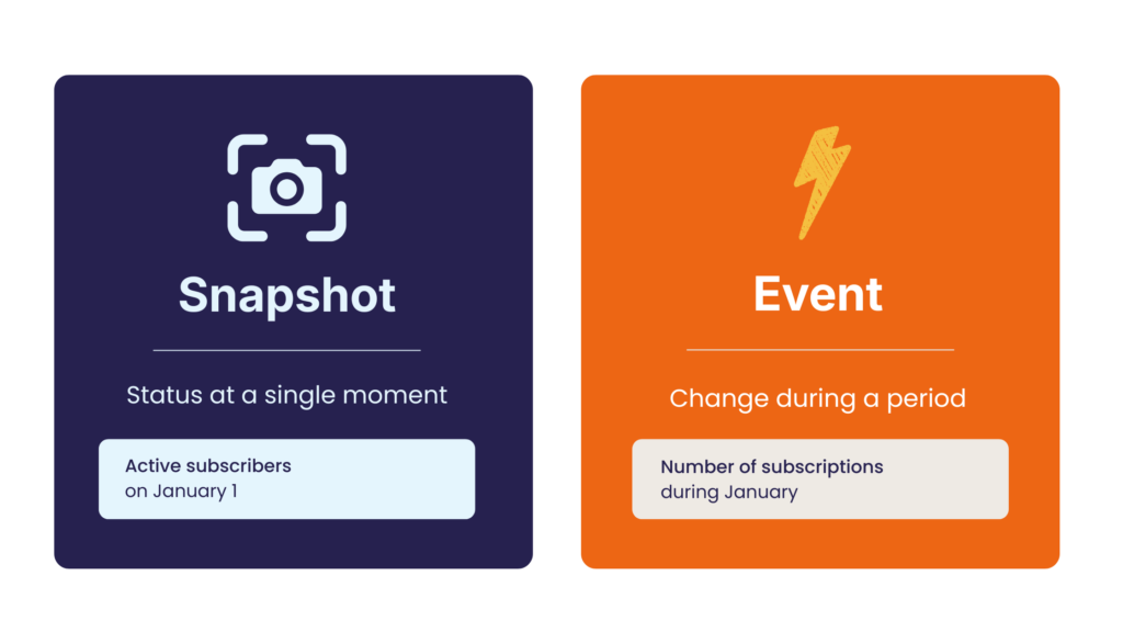
A snapshot is a status. It’s the state (condition) of your subject or a group of your subjects at a specific point in time. A snapshot is usually an aggregate, often a count (number of subscribers), but sometimes it can also be another form of aggregation, such as a sum (bank balance).
An event is a change that occurs within a specific time period. To determine which time period the change occurs in, you naturally need a time point for that change. Sometimes this is a single point in time (the moment you made a transaction or opened an email), but sometimes it has a start and end point (the start and finish of a race, the time you entered the payment funnel until you completed the transaction). To determine which time period the change belongs to, you have to select a specific point in time.
A snapshot belongs to a single point in time; an event belongs to a time period.
Think of it as a balance sheet and a profit and loss account. The snapshot is like the balance sheet: a snapshot of where the company stands at a given moment, for example, on the last day of the year. The events are like the profit and loss account: they show how you’ve progressed from one status to the next over a certain period. This way, you can keep in mind that a snapshot tells you “how things are now”, and an event shows you “what has changed.”
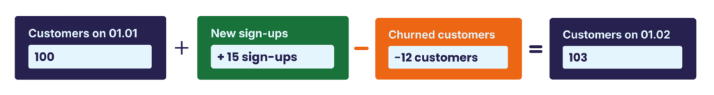
In other words, the snapshot at time t is equal to the snapshot (status) at the starting point (let’s say t = 0) plus all the events that occurred during that period.
So the formula is:
Status at t = 0 plus the sum of all events in that period = the status at t + 1
You can see that the concepts are not independent but are interrelated.
Quite simply: if you confuse them, it can lead to errors, incorrect conclusions, or, at the very least, considerable confusion. So, it’s important to be clear about what is what.
Where do things go wrong with the time dimension?
Time is often one of the most difficult factors in data analysis.
There are two common problems in this context.
1. Summing over time.
Generally, you can easily sum snapshots and events across dimensions, such as regions, but the time dimension works differently.
Although there’s a natural hierarchy in the time dimension (7 days in a week, just over 4 weeks in a month, 12 months in a year), you can only sum events.
With snapshots, this is absolutely not possible. They don’t have a cumulative meaning: each snapshot (status) replaces the previous one.
For example, if you have 100 members on Monday, 102 on Tuesday, and 103 on Wednesday, you obviously don’t suddenly have 305 members.
This is possible with events, but not with snapshots.
You can aggregate snapshots over time in other ways, but you can’t sum them. In practice, the last (ultimo) or first (primo) is often used. But sometimes, minimum, maximum, or average can also be appropriate.
2. Filters over time periods.
It’s quite common to apply filters to dashboards. Sometimes you can choose date ranges with a start and end date, in other cases you can select the last x weeks or y months. This type of filter usually only makes sense for events, not for snapshots.
Now, I can hear you thinking, “But that should be fine, I want to see the trend over the last x period.”
That may indeed be true. But is this very logical?
Sometimes it is, but very often it isn’t.
People often don’t know what they’re looking at anymore.
The status of active customers last week? New customers? Customers who renewed their subscriptions this month? (Are annual subscribers who haven’t changed anything included in this selection or not?)
In short, often a lot of confusion.
Here’s our advice: Keep snapshots and events clearly separated to prevent confusion and errors.
How to put this into practice
Here are a few concrete things to keep in mind.
- Make sure dashboards, charts, and axes are clearly labelled so users can immediately see what they’re looking at. That’s a no-brainer, but it prevents a lot of confusion.
- Pay extra attention when using time filters in dashboards that contain both snapshots and events. If you add a time filter, make sure it’s clear which visualizations are responsive to it. Sometimes you don’t want a snapshot to change based on that time filter. In any case, your design should make it clear which charts and tables should and shouldn’t be responsive. If filters are necessary, try creating separate dashboard tabs to properly separate the various figures.
For example, a separate dashboard tab for the snapshots on a specific date (often “now,” but it could also be another time), and a separate one for events (over time, usually x-axes with time dimensions). That’s not always possible, but the most important thing is to think carefully.
- If you’re working with tools that offer users a lot of room for data interaction, such as Looker, you need to be extra careful. If users are free to aggregate themselves, they may click together an incompatible combination. The tricky part is that you don’t always see this yourself. You probably would have realised that cumulative membership numbers aren’t useful, but only if you happened to test it yourself.
In that case, make sure in the configuration, for example in LookML, that snapshots cannot be accumulated over time, while this is possible for events. This prevents users from accidentally accumulating snapshots over time and making a mistake.
And always test it yourself!
It may seem like a minor detail, but the distinction between snapshots and events determines whether your analyses are accurate. Make it explicit in your models, explain it to your colleagues, and check it in every dashboard.
It will save you a lot of misunderstandings later.