(Personal blog)
When you have an empty white page staring at you, you realise what intimidation feels like. Where do I start? What do I design? And most importantly, how do I create something that makes sense?
I don’t quite remember how I started with dashboard design. I don’t remember the first thing that Tamara de Heij mentioned when she suggested it, but I surely remember the second.
One day, we were in the office. She was drawing on the whiteboard we have on the first floor. She called my name, and I came down and saw a board filled with shapes, arrows, and notes.
Unsurprisingly, I had no idea what I was looking at.
Tamara had spent the day sketching different use cases she and the team were dealing with, along with a few versions of dashes a client needed at that moment. At first sight, everything seemed overwhelming.
Then she said, “Let’s first try to make a template.”
Structureeee
Many of you would probably think that this is the obvious next step.
As someone who doesn’t naturally think in a structured way, I appreciate the organised thinking of the people I work with, probably more than they would ever know. It always gives me a framework I can build on.
I went upstairs and started working on what we called our templates. Before designing anything, I had to do some research. Specifically, I needed to understand the visual possibilities of Power BI, the tool used later to build the dashboards in this case.
I couldn’t design something that wasn’t feasible. There are clear limitations, even when custom visuals are possible. Every project also comes with a timeline and a budget, and the templates had to fit within those boundaries, while leaving room for feedback, checks, and iterations.
Once we had the template, everything became more structured, and the process felt calmer because we already had a sense of how the final product would look. Or so we thought.
Starting with the basics: colour
I began with the foundation. After browsing the internet and exploring the design capabilities of Power BI, which, in my opinion and in the opinion of others, is not the most cooperative interface (especially under time pressure), I focused on colours.
To direct the choice, I turned to theory.
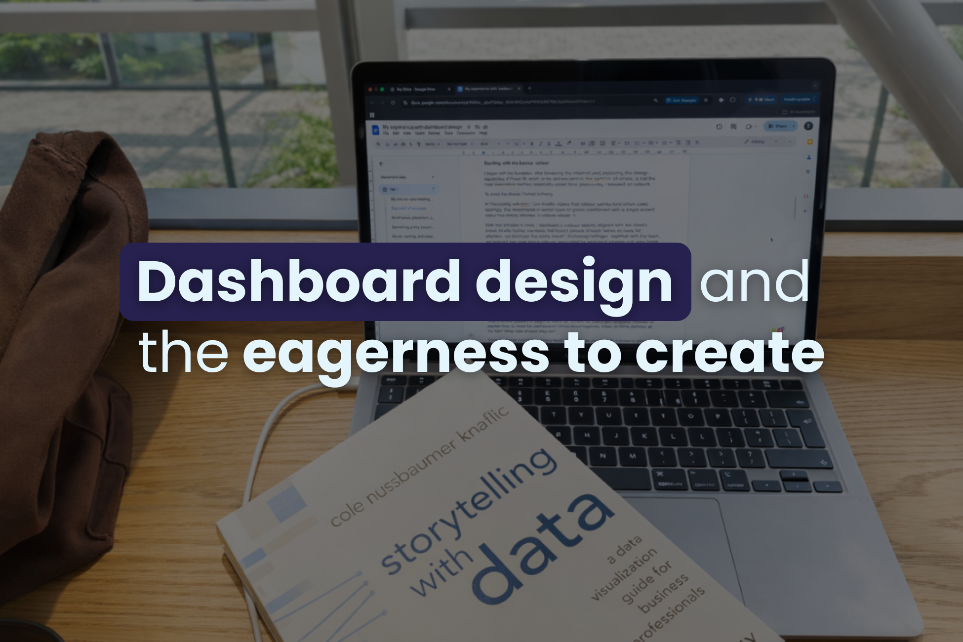
In “Storytelling with data”, Cole Knaflic states that colour works best when used sparingly. She recommends a neutral base of greys, combined with a single accent colour to direct attention and reduce visual noise.
With that principle in mind, I developed a colour palette aligned with the client’s brand.
Knaflic further mentions that brand colours should “serve as cues for attention, not dominate the entire visual”. Following her logic, together with the team, we selected two core brand colours, supported by additional shades and grey tones. We kept the dashboards readable and aimed for a clear visual hierarchy.
Always keep in mind that people’s perception is more limited when it comes to relative saturation, but a benefit is that it does carry quantitative assumptions. You can see what’s important fast if different shades of the same colour are used.
Preparing a colour palette may sound trivial, especially to people who have worked in design or data for a long time, but it plays the biggest role in how information is perceived.
Wireframes, placement, and first impressions
After colours, I moved on to wireframes. Different layouts. Different positions. Different sizes.
This is where questions begin to stack up. Where do filters go? Is space needed to explain how to read the dashboard? What about legends, titles, or KPIs (BANs) at the top? What size should they be?
Order becomes mandatory. Important elements go on the left. I chose to place filters there as well, so users make their selections before their eyes move through the data. Multiple tabs appear. Variations evolve. And then comes the part we all know, yet do not always do enough: feedback.
Feedback from my ‘data-knowledgable’ colleagues helped refine the logic and feasibility. Feedback from end users brings a different perspective. Often, they are not technical people and need to quickly and with minimal effort understand what they see. Confusion creates frustration, and a dashboard that overwhelms will not help someone spot an issue or recognise a win.
Something pretty becomes something useful
You might expect a discussion about colour theory or design rules here. That advice is useful, but common. What makes dashboard design interesting is that ideas you have on paper or on your computer screen rarely move perfectly into tools, and data rarely behaves neatly.
Designs are created with dummy data, but real data doesn’t always look that clean.
That’s why, when we started presenting the dashboard designs to clients, we made sure to include examples of both ideal and less ideal scenarios. Sometimes, designs look different once they are built in Power BI. Colours shift slightly, even when the correct codes are shared.
A graph can appear balanced and calm in theory, then shift completely once actual values are shown. Peaks happen. Drops happen. Suddenly, something carefully designed looks chaotic.
So, managing expectations early helps avoid disappointment later or the so-called cognitive dissonance. And the main lesson was to give ourselves room to adjust and to keep everyone informed when changes occurred.
Reuse, naming, and consistency
It was interesting to see how the same graph could appear across multiple dashboards for the same users. Recycling saves time and keeps everything cohesive and aligned with the brand and business needs.
Naming also plays a big role, because different departments often use different terms for the same metric. Agreeing on naming within a company helps keep the dashboards understandable and consistent.
The devil is in the details
We’ve all heard the phrase the devil is in the details, which, according to Google, means that small things often hide bigger issues.
Leaving time for checks is essential. When possible, asking a colleague to review your work adds another layer of quality. At i-spark , Esther Grovenstein is always my voice of reason. She always spots the one letter I missed. Or a very long Dutch word, I’ve most probably misspelt. Or that one time when I had to make a heat map of the Netherlands and ended up including the whole Benelux region instead…
People are built to create and to learn, and we at i-spark don’t plan on stopping doing new things anytime soon.