February may be the shortest month on the calendar, but the data and AI industry didn’t get the memo.
What stood out this month?
If February had a theme, it was that AI is growing up and the rest of the data world is catching up around it.
We’re past the chatbot phase. Databricks shipped an agent that can coordinate multiple AI models to run entire workflows autonomously. Claude Sonnet 4.6 is now genuinely competitive with models that were considered top-tier just a few months ago. And OpenAI introduced security controls specifically designed to protect AI that’s doing real, sensitive work, which is itself a sign of how seriously the industry is taking this now.
Security and governance were consistent topics, too. Snowflake added automatic PII detection inside JSON columns. Looker tightened up content certification.
And across nearly every platform, there was a clear push to make data more accessible to non-technical users: better navigation, smarter filtering, fewer reasons to ask an analyst for help.
It was a full month. Let’s get into it.
Power BI
February’s Power BI update is a mix of useful new features and some important deadlines you’ll want to get ahead of.
On the new features side, you can now write prompts up to 10,000 characters on Copilot, which opens the door to much more detailed, nuanced instructions. Inside Power BI Apps, it’s also gotten smarter at navigating: instead of hunting through reports yourself, you can just ask what the app covers, and Copilot will point you in the right direction or summarize the contents for you.
The old Text Slicer has been changed to the Input Slicer. If your dashboards involve long lists of SKU numbers or client names, users can type free-form text using logic like “contains” or “starts with” to find what they need. Additionally, you can now paste a list of values directly from Excel or an email into a slicer, skipping checkbox-clicking entirely.
There are some design improvements worth mentioning, too. Font rendering has been fixed for non-Windows users, so reports will finally look consistent whether someone’s viewing them on a Mac, an iPhone, or an Android device. The new Card visual now supports up to 10 callouts and lets you click a category directly to cross-filter the rest of your report. Tables and matrices have also gone back to auto-fitting to content, which keeps layouts looking clean rather than stretched.
Now for a couple of deadlines worth putting in your calendar.
If your team uploads Excel or CSV files directly to the Power BI Service, that workflow is being retired. New setups will stop working after May 31, 2026, and existing files will stop refreshing on July 31, 2026. The fix is to move these over to a Desktop-based workflow sooner rather than later.
The Scorecard Hierarchies, which let you build multi-level structures by region, division, or team and auto-generate filtered views, will be removed on April 15, 2026, along with the Heatmap view that came with it.
Snowflake
There’s a lot to unpack from Snowflake this month.
You can now run a fully managed Postgres database directly inside Snowflake. That might sound technical, but the implication is significant. Historically, you’d run your transactional database somewhere else and move data into Snowflake for analysis. Now both can live in the same place, which simplifies architecture headaches and makes it much easier to bring existing Postgres applications into the Snowflake ecosystem without rewriting everything.
On the AI side, Cortex Code is Snowflake’s answer to tools like GitHub Copilot, but with one key difference. It actually knows your environment. It understands your specific tables, schemas, and permissions, which makes its suggestions far more relevant than a generic coding assistant. It’s also expanded to support non-native workflows like dbt and Apache Airflow, so your developers can tap into it even when working from their local terminal or VS Code.
Snowflake Notebooks are also now generally available. If your data scientists have been bouncing between Jupyter and Snowflake, this closes that loop. They can now build and run Python and SQL directly where the data lives, with GPU support, Git integration, and the ability to pass data seamlessly between Python and SQL cells in the same notebook.
Data quality monitoring got a nice upgrade, too. There’s a new UI in Snowsight that lets you manage data quality checks without writing SQL, and an AI layer called Cortex Data Quality (currently in preview) that looks at your metadata and proactively suggests which checks you should probably be running.
Finally, Snowflake’s governance layer can now automatically detect sensitive data, things like PII, inside JSON and semi-structured columns. If your team has ever had to manually audit variant columns for hidden personal data, you’ll know what a painful process that is. Having it done automatically is a great step forward for compliance teams.
Databricks
There’s a theme running through Databricks’ February updates: closing the gap between where your data lives and where your work actually happens.
The Supervisor Agent is now generally available, designed to coordinate multiple specialized AI agents working together to complete complex, multi-step tasks without someone needing to babysit every stage. Think less “chatbot” and more “automated workflow that can run an entire process end to end.” Dealing with things like recurring data audits or multi-stage reporting pipelines should become easier.
Alongside that, Databricks launched Lakebase: a serverless, Postgres-compatible database that sits inside the platform. The practical upshot is that you no longer need messy pipelines shuttling data between your live application and your analytics warehouse. Both can run on the same platform now, on the same data. It even includes instant branching, so you can test changes against real data without any risk to production.
For non-technical users, there’s a new Discover page with something called Domains, currently in beta. Instead of navigating by folder structures and table names, teams can now browse data assets organised by business area.
On the connectivity side, Lakeflow Connect has added managed connectors for HubSpot, TikTok Ads, and Google Ads. Managed means Databricks handles API changes and schema updates in the background, so your marketing dashboards don’t quietly break every time a platform changes something on their end.
There’s also a technical change that’s worth flagging if your team uses Power BI on top of Databricks. ADBC is now the default driver for new connections, replacing the older ODBC approach. It transfers data in a columnar format that’s significantly faster, which should translate to noticeably snappier dashboards for end users.
And finally, the AI Gateway (currently in beta) gives yoy a single place to manage all the AI models you’re using, whether that’s OpenAI, Claude, or something else. You can set rate limits, track costs, and configure automatic fallbacks so that if one provider goes down, another picks up the slack without anyone noticing.
Klipfolio
No big product updates from Klipfolio this month, but their CEO Allan Wille published a useful guide to metric naming conventions in PowerMetrics that’s worth a read if your team is building out a data or analytics practice.
The core idea is simple but easy to get wrong: name your metrics the way people actually talk about them, not the way your database is structured. So “Customer Acquisition Cost” instead of “CAC_total_v2_final.” Think, if you mentioned the metric name to a colleague in passing, would they instantly know what you meant?
From there, it gets into some practical territory. Things like not baking time periods into metric names (so “Revenue” rather than “YTD Revenue,” since time is a filter, not part of the metric itself), when to include words like “Average” or “Rate” and when to leave them out, and why putting your data source name in a metric (like “Salesforce Opportunities”) is a bad idea that will come back to bite you when you switch tools.
There’s also a handy checklist at the end that you can run through before publishing any new metric.
If your analytics setup has gotten a bit messy over time, or you’re starting fresh and want to build good habits early, it’s a solid reference to bookmark.
Looker
February was a busy month for Looker with a bunch of improvements that aim to make day-to-day work smoother, especially if you deal with large datasets, data governance, or self-service analytics, and as a partner of the tool, we’re more than happy to share them.
The biggest one for most teams is probably the change to merge queries. If you’ve ever hit the frustrating 5,000-row limit when merging query results in Looker, that cap is now gone. Merge joins happen directly in BigQuery instead of in Looker’s memory, which equals faster results and no more creative workarounds for large datasets. It’s in preview right now, so you’ll need to enable it via Looker Labs.
On the governance side, content certification got an upgrade as well. As an admin, you can now certify LookML dashboards, automatically flag anything uncertified with an “ungoverned” badge, and even choose whether certification gets revoked when content is edited. This should help if keeping your data standards consistent across the organization has felt like an uphill battle so far.
Moreover, for controlling data exports, a new permission lets admins decide exactly who can pull full query result sets from Looks and Explores. Worth a look if large exports are a governance or cost concern for you.
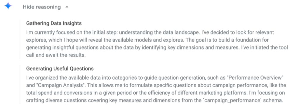
And on the AI front, Conversational Analytics can now show you its reasoning. Click “Show reasoning” and you’ll get a plain-text breakdown of how it interpreted your question, which makes it a lot easier to trust, verify, and troubleshoot the answers it gives you.
Finally, Self-Service Explores picked up two new preview features: users can now upload data directly from Google Sheets, and Explore owners can refresh their data when the source file gets updated. Small additions, but they go a long way toward making self-service analytics actually accessible for non-technical teammates.
Open AI
We recently made the switch from ChatGPT to Claude internally, but if you’re still using OpenAI, this one’s worth knowing about.
As we discussed in last month’s newsletter, security risks and the importance of governance are growing, and OpenAI is responding with two new features designed to give users more control over their data.
The first is Lockdown Mode, an optional advanced security setting aimed at high-risk users like executives and security teams. When enabled, it tightly restricts how ChatGPT interacts with external systems. Web browsing, for example, becomes limited to cached content only, meaning no live data leaves OpenAI’s network, making it far harder for attackers to intercept sensitive information. For now, the feature is available to business customers on Enterprise, Edu, Healthcare, and Teachers plans, with a widespread rollout planned in the coming months.
The second is a new “Elevated risk” label, which will appear consistently across ChatGPT, ChatGPT Atlas, and Codex whenever a feature carries additional security risk. Before you engage with higher-risk capabilities, you will be able to see this standardized guidance, giving you the space to make informed decisions about your data.
Both features are a direct response to the growing threat of prompt injection attacks, where malicious third parties attempt to manipulate AI into leaking sensitive information or following harmful instructions.
Claude AI
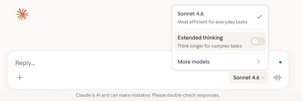
If you’ve been using Claude, you might have noticed things feeling a little different lately. That’s because Anthropic dropped Claude Sonnet 4.6, and it’s a pretty big deal.
According to their official website, in coding tests, developers actually preferred Sonnet 4.6 over Opus 4.5, the previous flagship, almost 60% of the time. They say it is less frustrating to work with over long sessions, better at following instructions, and far less prone to overcomplicating things.
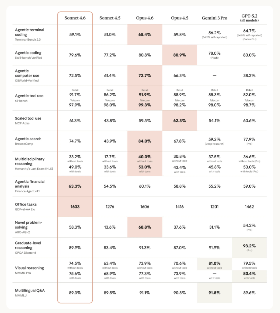
Comparison of Claude, Gemini and GPT models. Source: https://www.anthropic.com/news/claude-sonnet-4-6
There’s also a new 1 million token context window in beta, which basically means you can hand it an entire codebase or a pile of research documents, and it’ll actually work through all of it coherently.
Claude can now navigate software the way a person would by clicking, typing, and switching between tabs. Early users are already seeing it handle things such as multi-step web forms with what looks a lot like human-level competence.
And if you use Claude in Excel, it can now connect to external data sources like PitchBook, Bloomberg, and FactSet directly from your spreadsheet without the need to switch tabs.
Sonnet 4.6 is now available on all plans and is the new default, even on the free tier.
A question for you
The shift from AI as something you ask questions to, towards AI that coordinates, plans, and acts on its own, is happening faster than most people expected. And it raises a question that’s worth sitting with before the tooling gets too far ahead of the thinking.
So grab your rubber duck and have that conversation. Or take a colleague for a coffee and discuss together:
Where in your work would you trust an AI agent to act without checking in, and where would you absolutely not?