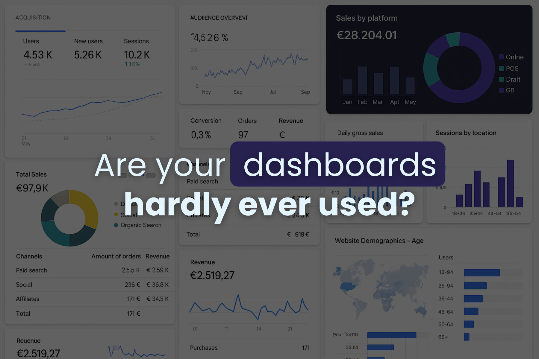
Picture this: a new dashboard goes live, and in the next team meeting, everyone nods appreciatively. “Looks great,” someone says.
Two weeks later, screenshots of the same meeting from Excel start showing up: a sales manager’s personal spreadsheet and the same old debates about “what really happened last quarter.”
The dashboard? Still there, completely ignored.
This is the blueprint of a usability challenge with trust, timing, and ownership.
A dashboard only creates value when it directly supports your goals and serves as evidence for your decisions in meetings.
When it falls out of sync with these moments, it becomes part of the background: something that looks helpful but is hardly ever used.
Dashboards do more than show numbers
Treating dashboards as completed products once the right metrics appear on the screen is not always the way to go. Displaying data is enough to create value.
When someone glances at the dashboard in the middle of a busy day and feels confident enough to act based on what they see is then that the collected information turns into a useful spark.
Too often, dashboards don’t reach that stage. When users can’t see how a figure fits within a broader goal or historical context, they hesitate. The delay comes from a lack of connection between data and decision.
Dashboards that require interpretation before action create friction, which makes them easier to ignore.
Designing around future decisions
User-focused dashboard design starts with understanding how decisions are actually made.
In most companies, choices are made quickly, often under deadlines, and by a relatively small group of people responsible for the outcomes. The supporting data is revisited at predictable intervals, during daily stand-ups, weekly updates, or campaign reviews. These are the moments when dashboards either spark discussion or become irrelevant.
Dashboards often lose their purpose because they try to serve everyone at once. Analysts, managers, and executives may share the same view, even though their questions differ. When it attempts to satisfy all audiences, it ends up addressing none of them well.
A usable dashboard belongs clearly to someone. That person understands what questions it is meant to answer, recognizes the data behind it, and trusts the information enough to take action with confidence.
Trust in dashboards is built through the same kind of choices that reliable reporting requires. Someone has to decide what a number means, where that logic lives, and when a solution is solid enough for today rather than perfect for every future scenario.
When those decisions are made deliberately and revisited when needed, dashboards gain credibility and remain part of daily work.
Turning data into information and products your people act on
Many dashboards overwhelm users by presenting too much action at once, forcing them to decide where to look before deciding how to respond. That mental effort slows decision-making and distracts from outcomes, and builds hesitation.
The opposite problem happens when dashboards are too minimal. A clean interface means little if essential context is missing. Without benchmarks, timeframes, or trends, a number loses meaning.
The most effective dashboards strike a balance: they provide enough context to make data meaningful without burying it in detail. The general guiding principle is that if a dashboard needs a long explanation in a meeting, it has already lost its purpose as a decision-making tool.
The i-spark approach: dashboards that stay in use
At i-spark, we view dashboards as living decision tools, not static data displays. That mindset changes where the process starts. Instead of selecting metrics first, we start with the real questions people are trying to answer.
We also recognize that sometimes those questions aren’t fully defined, and that’s fine. The key is to wait until decision moments and ownership are clearly understood before building anything. So we always ask the questions,
Our method revolves around a few core principles.
- Each dashboard has a designated owner who is responsible for its accuracy and use.
- Context is essential because judgment depends on understanding data in its full context.
- After delivery, we maintain active feedback loops to refine the dashboard and remove any metrics that add noise or confusion.
- Discussions about data quality are open and honest, ensuring reliability is never assumed but earned.
In this way, we avoid empty certainty and protect the users from oversimplification. When trust and shared understanding are missing, even the best-designed tools eventually fall out of use.
Frequently asked questions
What makes a dashboard truly usable?
A usable dashboard focuses on relevance, clarity, context, and action. It supports specific decisions, highlights why certain numbers matter at a given time, and helps your team move forward with assurance rather than having the experience of doubting.
How can we increase the chance that dashboards are genuinely used?
Adoption improves when ownership is clear, expectations are defined, and feedback continues after launch. Ongoing communication, regular reviews, and practical training help dashboards stay aligned with real workflows.
If you’d like to see how this method could work for you, visit our pages on data product design and analytics & BI implementation, or get in touch to discuss your specific challenges.